Wednesday 29 March 2017

Blue Koi Pond

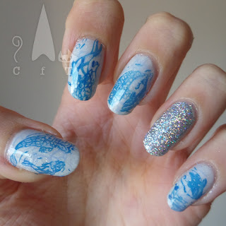
Hi everyone! Got something quite spring like to share today in light of the springy weather we've recently been having. I had a lovely relaxed evening doing these, and then wore them for a conference event at work which I enjoyed, so looking at them makes me feel positive, even though they didn't actually quite turn out how I expected!

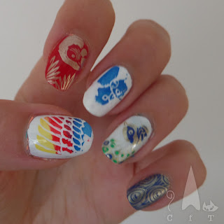
For some time I have been thinking of layering up some images from my koi stamping plate, but in the end I don't think it worked quite as well as I had in-visioned. I don't think that the initial paler blue stamping was very visible under the brighter blue fish. I used a shimmery pale base colour (colours listed below the pictures) which I thought worked well, it does need so many layers though!

I decided to add a bit of glitter as an accent nail, over a layer of off-white. I used Fun Lacquers 24 Karat Diamond for the first time and oh my goodness it is amazing! The pictures don't really capture it but it is such a perfect bright glitzy rainbow holo glitter! I have tried a few amazing holo's now, and this one is definitely the best silver, it really brings out the rainbows! The only downside of using this polish for this design is that it was so bright it was a bit distracting from the subtly of the other nails, I also kind of wanted it on all my nails! So if I do this design again I'll probably use a normal glitter or less intense holo.
Colours used: Lakodom - Picture Polish, Blueberry - Barry M, Cobalt - Barry M, Butterscotch - Barry M, 24 Karat Diamond - Fun Lacquer

Friday 24 March 2017

ILNP Spring 2017 Collection

Hi everyone, happy Friday! Today I'm excited to show you my swatches of ILNP's new spring 2017 collection. It's a little later than I would have liked but it had a long journey from Vegas to Hampshire UK before it reached me! So you've probably seen these already, but here's more!

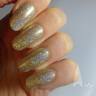
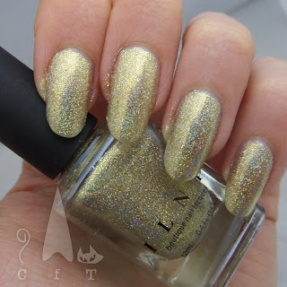
ILNP released two six polish collections and one limited edition so there's a lot to choose from. I went for the main spring collection which features six shimmery holographic spring shades. First up us Versailles, a super holographic gold. I really like this one, it's elegant and very sparkly, and I love the name. This is fairly sheer so you'd need two to three coats. Below you can see it in bright light and natural light.
Next is Ballet Slipper, another super sparkly one! This one isn't as much my usual sort of colour but I do love just how sparkly it is. It's even more sheer so unless you're wearing it over another colour you would definitely need at least three coats. Below is three coats and you can still see my nail line.
Next up is Aria, a lovely pale blue super holo. This one turned out to be a one coater which was a surprise! It's got a more solid opaque coloured base and more densely packed holographic pigment. It has a lovely icy blue look.
Next is Yours Truly, I expected to like this a little more, but it's not quite as sparkly as the others. Though it does still have some holo shimmer. This one is quite sheer as well so you'll probably need three coats.
Next is Bermuda Breeze, one I was particularly excited about trying. Two coats are needed for this one. It's really pretty and again, packed with holo sparkles. I think this one pairs really well with the next one and would be great for mermaid themed designs.
And finally, High Tide, one I just couldn't resist, this is exactly my sort of colour! This one needs two to three coats and has, yes, more holographic sparkles! It has a nice green shift to it too. A perfect mermaid colour! I think this is my favourite of the bunch.
So in conclusion this is a lovely collection, very spring! I'm already thinking of spring and Easter designs I can do with the whole collection altogether. So High Tide is my favourite but I rather like Versailles as well. I originally got all the blue/green/purple ones and then caved in and ordered the pink and gold as well, and I have to say I'm glad I did!
Thursday 16 March 2017

Sutherland Tartan Nail Art

Hi everyone! Today I'm wearing tartan nail art and I rather like it! I meant to do this design for my trip to Edinburgh in February but ran out of time so gave it a try now. I really like the way it turned out. Our trip to Scotland was primarily to visit some of the places where the Outlander TV series was filmed, as me and the girls I went with are big fans of the books and TV series. So I was thinking about doing Fraser tartan, but then I thought as I have a Scottish clan surname myself I'd give that a try! So this tartan is based loosely on Sutherland Tartan.

I started with a base of muted green (colours listed below the pictures). For the blue lines I mixed some coloured polish with clear polish on my Uber Mat. I used a flat nail art brush to dab it onto my nails in thick lines. Once dry I used a striping brush to paint some thin white lines, and then gold lines on each nail. I used a copper, gold and black glitter as an accent nail. I have had this nail art on for four days now and I expect I might even keep it for the weekend, the only downside being that I don't have anything else to put on the blog!
Colours used: Green Park - Nails Inc, My Car Has Navy-gation - OPI, Alpine Snow - OPI, Gold Digger - Barry M, Belgrave Square - Nails Inc

Sunday 12 March 2017

Oyster & Lace

Hi everyone, hope you've had a lovely weekend! I've had a fairly quiet one with lots of cleaning and a trip to Guildford and Hatchlands Park National Trust property. I've also done my nails twice so I suppose it was a pretty great weekend! Today's post was my first design, I've been meaning to use my lace stamping plate again and to try it over a neutral shade for months.

For by base colour I used Oyster from Barry M's autumn coconut infusion shades, it's such an elegant and flattering shade. You can see my original review of it here. I decided to use black stamping polish however mine is really running out and has got very gloopy so I had to switch to white and try and save it! The last ring finger on my right hand was a struggle! I added a bit of polish remover (in the absence of thinner) and just managed to get a little more polish out of the bottle.

So overall I wasn't that enthused by this one. It was nice enough, but I think some of the patterns being too small for some of my nails ruins the effect a little! Also not sure if the black and white really works or if the difference it too harsh. In the end I think it was a good experiment but I didn't keep it on  for any longer than a day, at least it was an excuse to do my nails again!
Colours used: Oyster - Barry M, Black Knight - Mo You London, White Knight - Mo You London
Stamping Plate: Fashionista 17 - Mo You London

Thursday 9 March 2017

Elegant Smoosh

Hi everyone! Something a bit different from my usual today, a smoosh nail art design with a teeny bit of freehand too! I saw a gorgeous white purple and gold smoosh on Sveta Sanders Instagram which I'd been meaning to try for a while, and then a design where someone had used negative space and smoosh (I can't remember who it was!) so I thought I'd combine the two. Smoosh is such a weird word but it does describe this technique well!

I used a clear stamper so I could see where I was placing the colours and tweak it if necessary. I started with a couple of layers of a Sally Hansen french manicure polish (colours listed at the bottom of this post). It had a very ethereal blueish glow which seemed odd for a french manicure but really worked with this design. I had a bit of a nightmare with it though, it took so long to try, and then peeled up in some places and had to be patched up when I peeled the stencils off.

Once the polish was dry (or so I thought!) I used some straight nail stencils to get a straight line and painted the upper two thirds of each nail white. Once dry I lightly applied the stencils again and began the 'smoosh' effect. I dotted white, purple and rose gold onto the stamper and pressed into randomly onto my nails. I love this colour combination, Sveta Sanders had a very good idea!
I used a nail art brush to paint a rose gold line under the smoosh, but felt like it looked a bit incomplete so added an outline around the bottom third of my nail as well. The rose gold (Cirque's Halcyon) is just so gloriously shiny so it stood out really well.

So all in all I was very pleased with this nail experiment! I think it looks elegant but interesting, and have kept it on for nearly a week so far as I can't quite bring myself to get rid of it! As always some nails I prefer to others, I think the thumbs where the best ones on this occasion.
Colours used: Sheerly Opal - Sally Hansen, Alpine Snow - OPI, Wigmore Street - Nails Inc, Halcyon - Cirque Colors

Sunday 5 March 2017

Stamping Sunday: Ornate Doodle Nail Art

Today's nail art stamping masterpiece is one that was just an experiment/trying out a new stamping plate but I really love the way it turned out, and ended up keeping it on for a week. My one regret is not getting some better pictures. I tried using just daylight instead of my light box but as you can see it was a dull day outside. Fortunately I have some pictures of the base colour in better light at the bottom of this post. It's Who Needs Love, a CBL valentines 2017 polish and it's rather lovely!

I used my Mo You London Doodles 01 stamping plate and black stamping polish for the images, and used my Uber Mat to create decals. Instructions on how to do it can be found here. I love the round images on this stamping plate as they're so pretty and versatile, you can put them in random places across the nail like I did, or if you have small nails they could even cover the whole nail. I think they'd look good as patterns at the bottom of each nail too.

For the detail I coloured in the images using some of Barry M's molten metal polishes. I used bronze, silver and gold but left out copper as I thought it would clash with the base colour. It worked better than expected and the gentle shimmer of the polishes sat nicely with the deep purple holo!
Colours used: Who Needs Love - Colors By Llarowe, Black Knight - Mo You London, Gold Digger, Barry M, Bronze Bae - Barry M, Silver Lining - Barry M

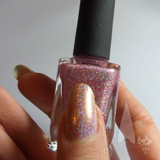
I've put a couple of pictures below of the other side of the decals, while they were drying after being coloured in. I just thought they looked rather pretty so it had to be documented! Under that is the base colour in daylight (on a brighter day!), and then in bright light so you can see some of that holographic flare!

Thursday 2 March 2017

Throwback Thursday: The One with Bird World

Today I'm bringing some more bright colour back to my blog and sharing some pictures that have been sat in my nail archive for aages. They just didn't quite fit in before it got colder and I got onto autumn shades. My inspiration for this design was a trip to Bird World on the Easter weekend 2016, so nearly a year ago! We saw some brilliant things, our favourites being some little chicks, an enormous peacock and the very vocal southern great horn-bill.

I used my Tropical 06 stamping plate from Mo You London for the images, as I am just not that good at freehand, and went for a mix of colours (listed below images). I used a picture of stamping techniques from standard stamping and gradient stamping (the parrot wing) to advanced stamping using my Uber Mat for the coloured in images. You can see instructions on advanced stamping here.

I think I will try this design again some time and try and make it a bit neater, but I did like the final look, it's so cheerful!
Colours used: Alpine Snow - OPI, White Knight - Mo You London, Gold Foil Effect - Barry M, Cobalt - Barry M, Key Lime - Barry M, Dead Heat - Barry M, Seven Dials - Nails Inc, Sloane Avenue - Nails Inc